UPDATE: The release candidate of xTuple 3.6.0 is available for download (no installer yet, just binaries and databases).
We have really ramped up our efforts this year to increase the appeal and usability of the user interface. From the new Desktop and Quick Start Wizard, to improved search functionality we have focused efforts on making it easier to get started and use xTuple. Version 3.6, now in Beta, will continue that trend by allowing users to launch virtually any document from any other document. That's right: No more hunting around the menu system trying to find the edit list for the records you are searching. Just jump to where you need to go from right where you are.

The new search cluster introduced in 3.5 now replaces all searchable widgets including customer, vendor and work order, and now you can create documents from any of those by selecting "New" on the menu list. Similarly The combo box pictured on the left also includes the ability to jump directly to the edit list for those items (provided you have privileges of course).
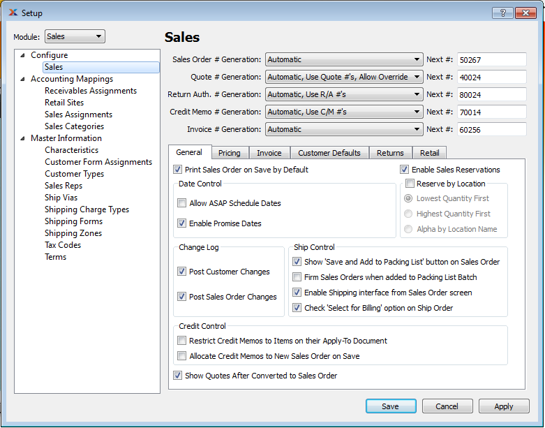
But that's not all. We've completely reorganized and consolidated the maintenance areas of xTuple in one common and easy to understand "Setup" screen.
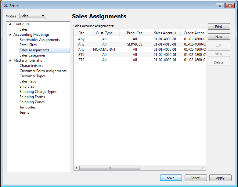
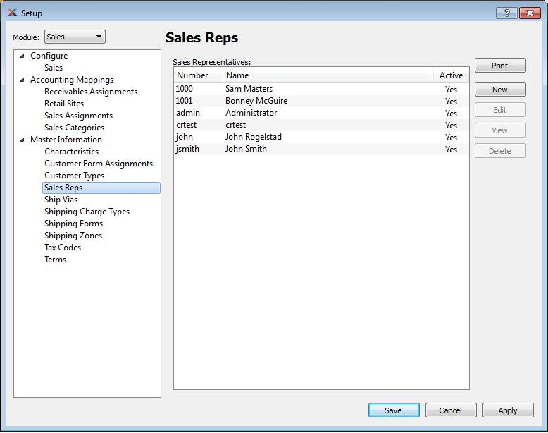
The new Setup screen in 3.6 allows you to view all the available setup modules and lists from one convenient place. Broken down by module It almost reads like a To-Do list of things that affect the set up of your system. The list is broken into 3 types of items: Configuration, Accounting Mappings, and Master Information.
Configuration pages typically display the "switches" to turn various options on and off on a particular module, in this case Sales. Note that you can easily switch from one module to another, or choose to show all modules at once.

Accounting Mappings pages, as the name implies, display lists of records that define the relationships between specific transactions and the general ledger. This is a critical area that people often get confused by. We hope that by grouping them all together it will be clearer what all screens are involved in mapping to the general ledger. Also, starting in 3.6 all the G/L Account clusters are programmed to help users search by the correct account type (I.e. Asset, Expense, Liability etc.) Users will still be allowed to shoot themselves in the foot if they insist, the system won't completely prevent you from entering an inappropriate account number, but they will at the very least be given a stern warning about "unexpected results" that may occur by doing so.

Finally we have "Master Information" which are all the reference tables used for grouping in reporting and sometimes workflow control. Again, it's nice just to have all these in one place where it's easy to quickly browse through them for completeness.

Finally, we even have good stuff for those seasoned users and sometime keyboard fanatics who long for the day when they can throw the mouse out the window. There is now ubiquitous (operating system specific) application of short cut keys on all the frequently appearing buttons including "Save", "Close","Post" and so on. You can also navigate tab widgets with keyboard control as well. We provide clues on these shortcuts via tooltips that appear when you hover over the buttons:

We hope both newbies and power users out there will be as excited as we are about 3.6. There's a lot more good stuff coming including an optional subledger for accounting, an overhaul of most Report screens, a major update of the Time and Expense system, and a new Project Accounting module just to name a few things. Stay tuned for more info as the release of 3.6 approaches!
